
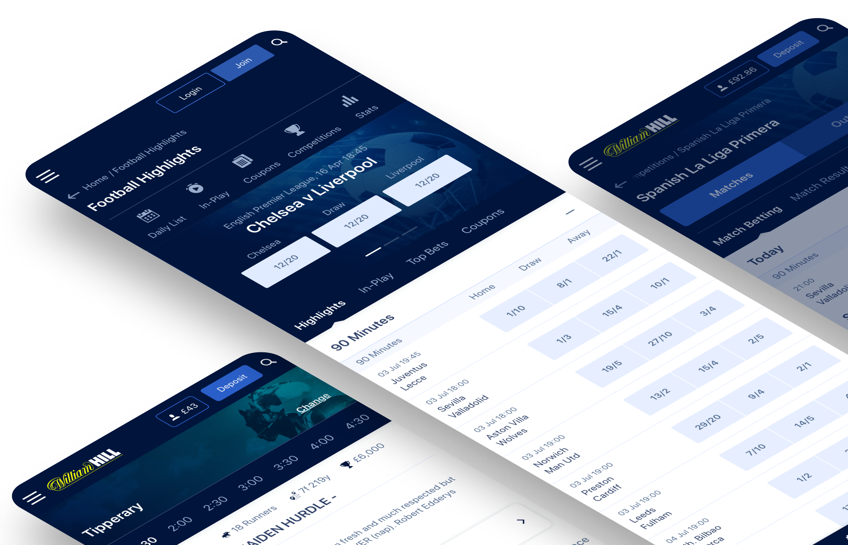
William Hill
William Hill™ is the world's biggest bookmaker. Its product offering includes sports betting, online casino, online poker and online bingo. Business operations are conducted from its headquarters in London, (where I was based as a UX Designer for Sportsbook) alongside satellite offices in Gibraltar, Leeds, Malta, Manila, and Sofia.
Background
After William Hill underwent a rebranding exercise, the UI team requested, that we test and validate the new designs to minimize the risk of negatively impacting the user experience. This is crucial since the site has a monthly traffic of over 40 million people and any drastic changes could lead to a loss in revenue.
Goals
The proposed goals for this experience were:
- Understand what are the user's first impressions and what visual elements grab their attention.
- Benchmark journeys of the live version and compare SUS scores of the new proposal.
- Benchmark components of the live version and compare SUS scores of the new proposal.
Research Methodologies
We conducted testing at the component and journey levels.
For component testing, we researched how UI elements such as paddings, font sizes, and backgrounds could affect the users first impressions.
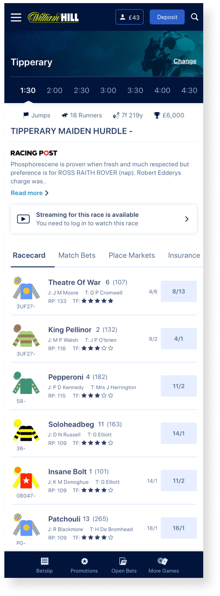
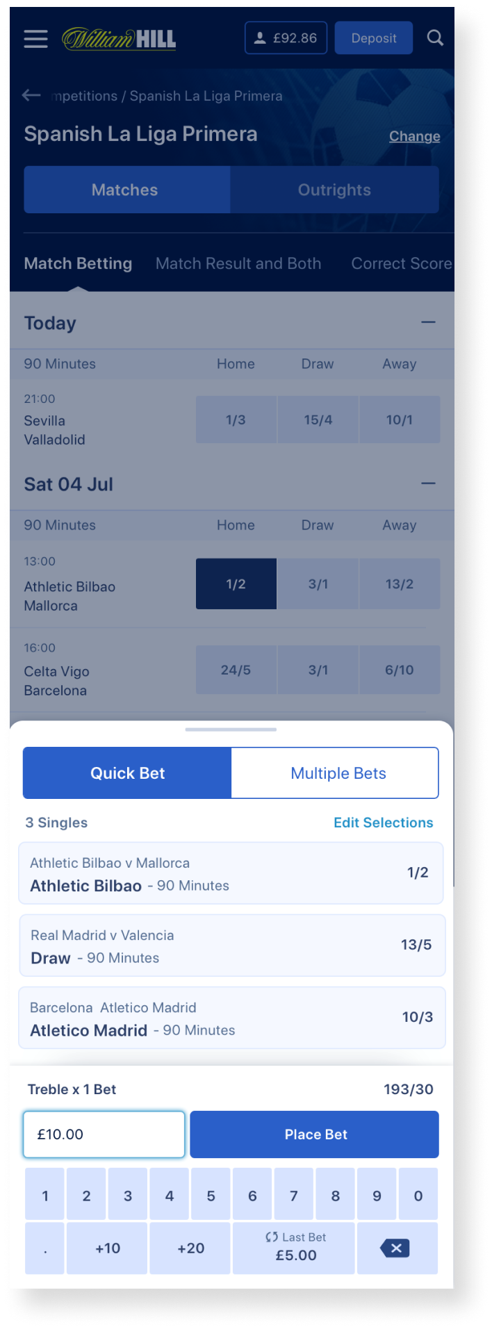
For journey testing, we tested experiences from selecting an event to placing a bet in three different sports - football, horse racing, and motorsports.
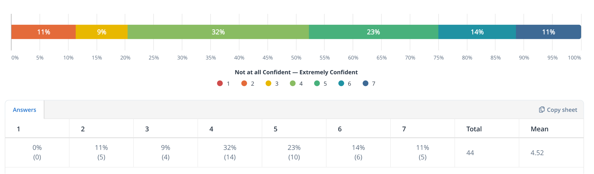
We used a range of testing methods including usability testing (with System Usability Scale (SUS) and Confidence metrics) and multivariate tests .
To assess Design perceptions we used the following methodologies:
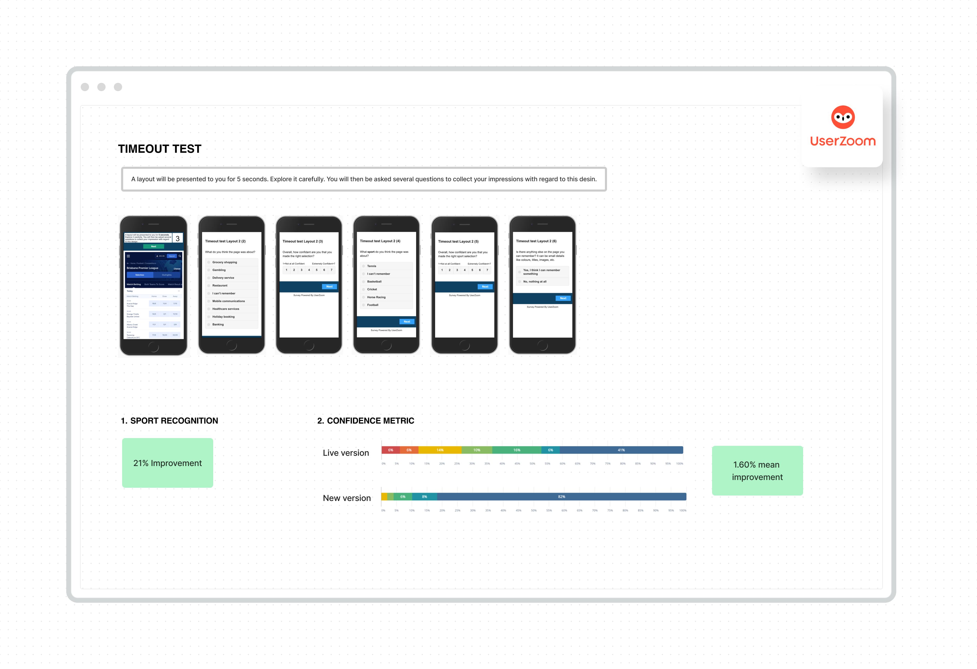
- 5-second test (Visual stimulus test)
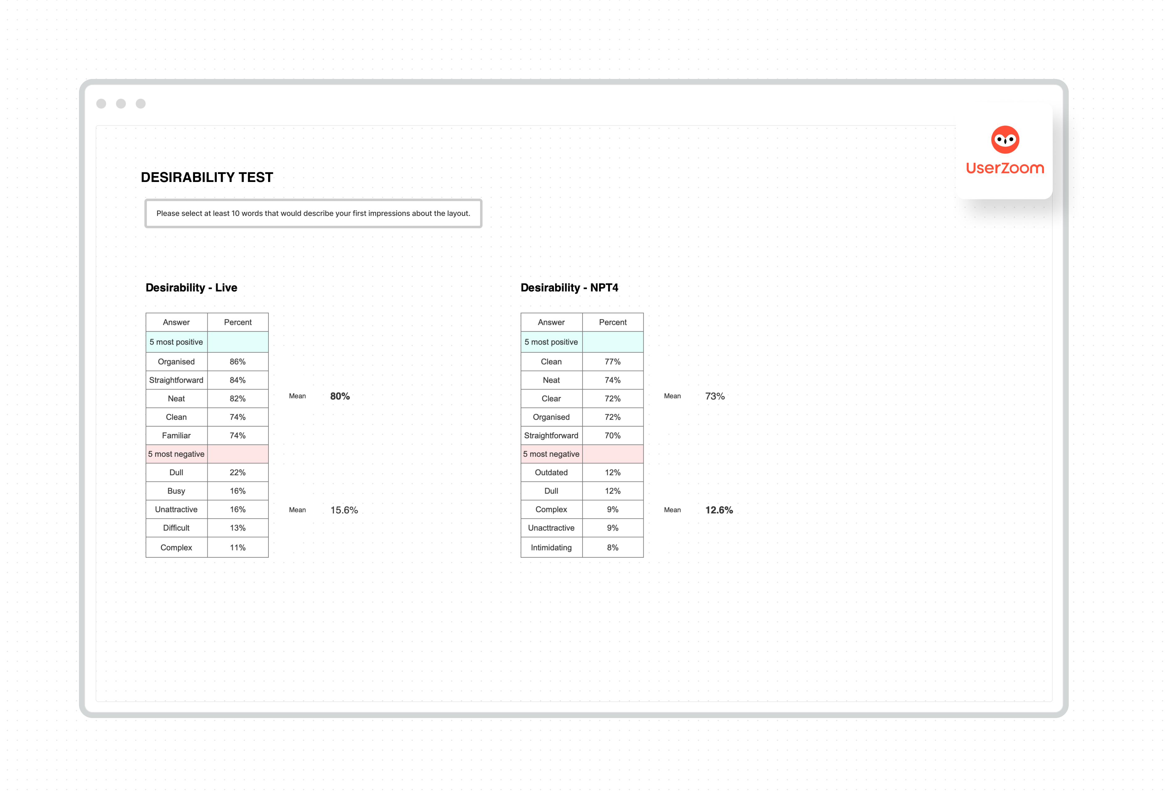
- Choice of words (Desirability test)
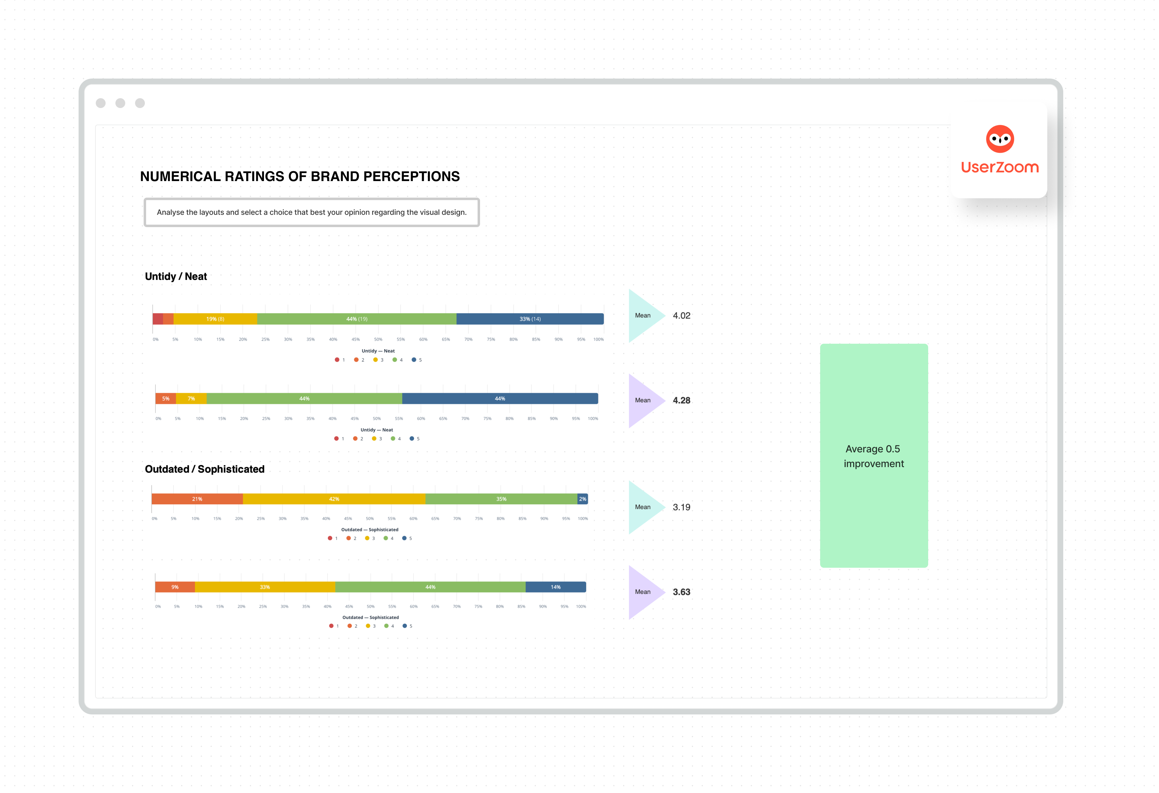
- Word rating (Semantic differential test)
Components
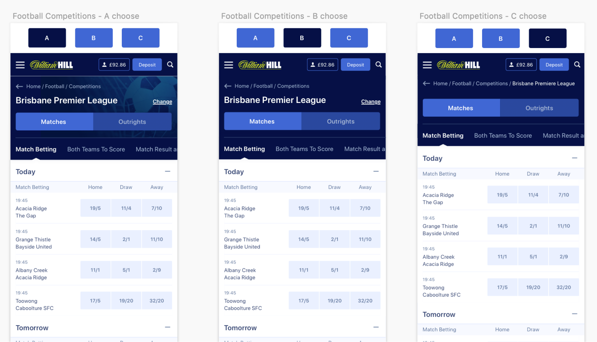
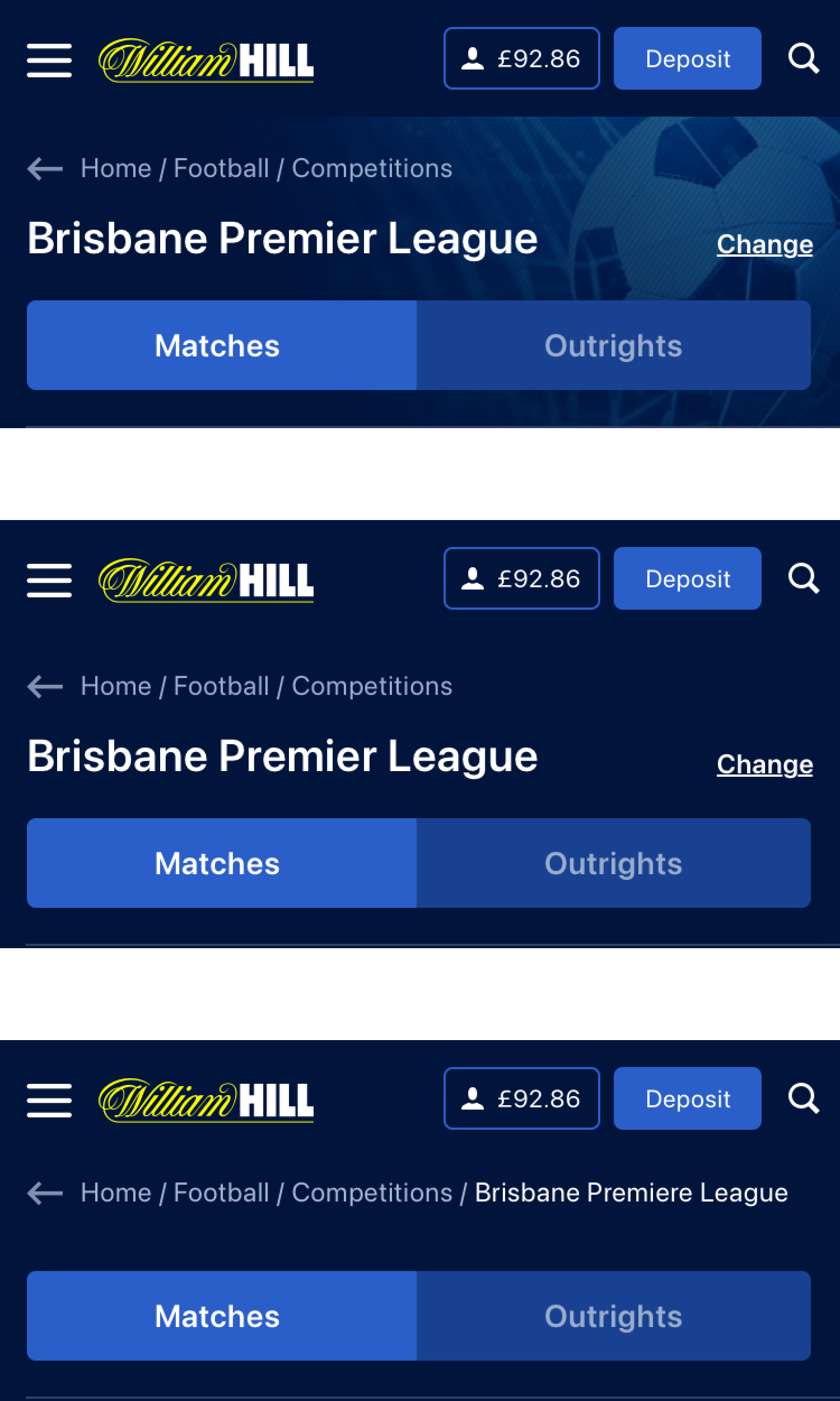
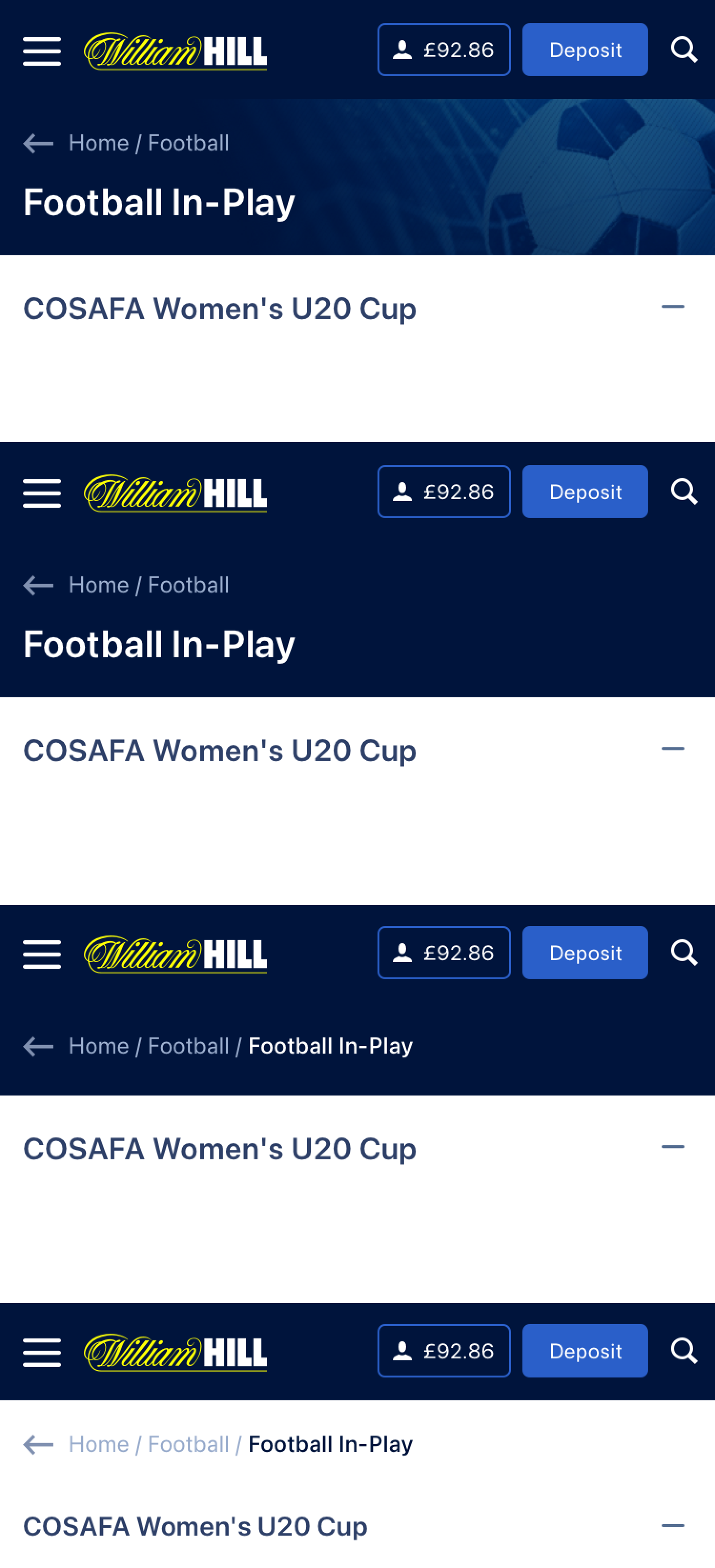
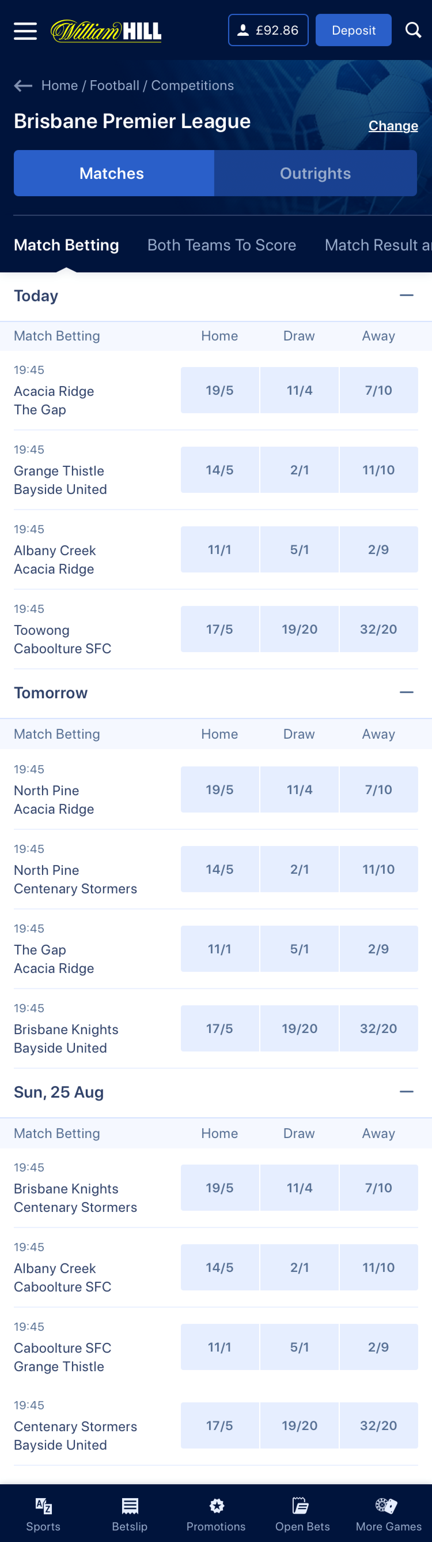
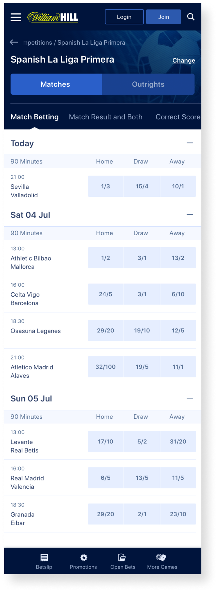
We developed a testing plan to evaluate the headers of Football pages. We tested different header versions and compared their performance to the Live version.
Our goal was to grasp the significance of colours, images, spacings, and font sizes in the visual perception of users before embarking on journey testing.
Component Discoveries
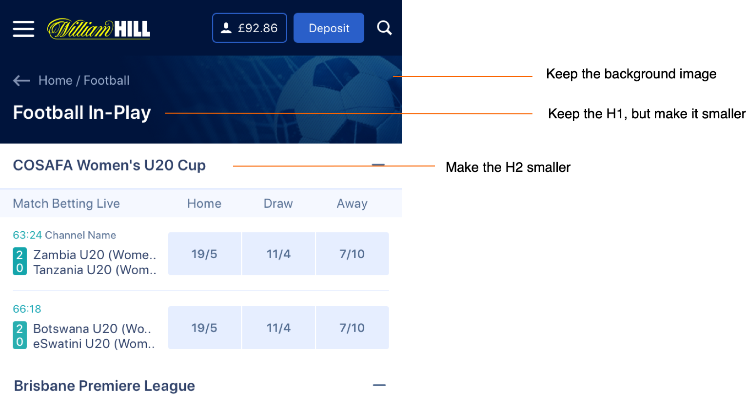
- The sports background image enhances sports recognition, fosters more favourable initial impressions, and contributes to the establishment of a visual hierarchy.
- An overwhelming 80% of users express a preference for a darker background.
- The inclusion of an H1 element significantly aids users in quickly comprehending their location within the website, particularly upon landing on this page.
- In terms of spacing, a majority of 60% of users lean towards a slightly reduced space between elements, facilitating the accommodation of more content above the fold.
Journeys
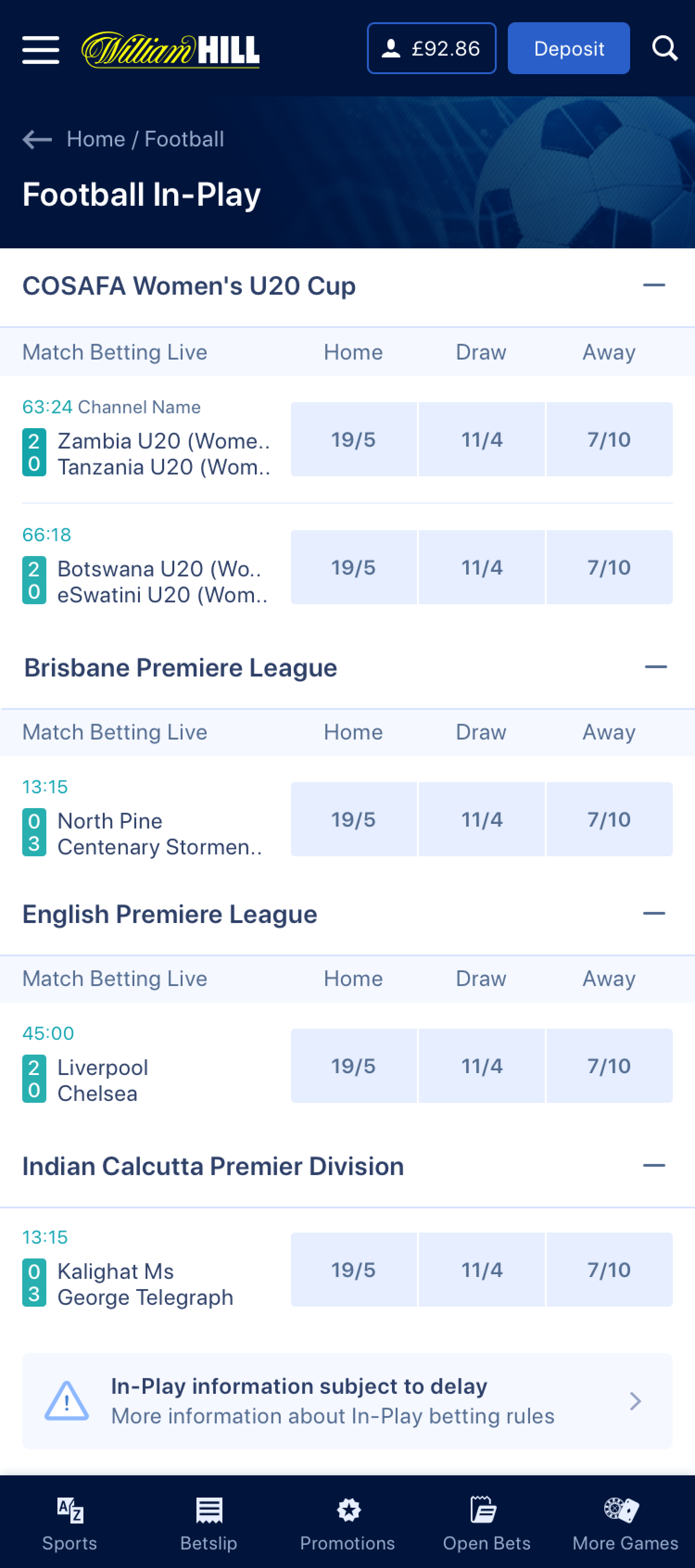
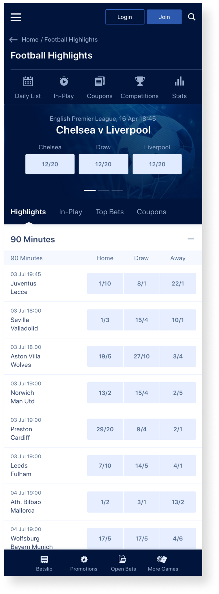
After conducting isolated component testing, we applied the insights gained from the experiment and designed three distinct user journeys. In each journey, users were tasked with navigating to a particular event, selecting a competition, and placing a bet.
Journeys Discoveries
In the Football Competition page:
- 21% more sports recognition in the new designs.
- 21% less of users recognise the wrong sport in the new designs.
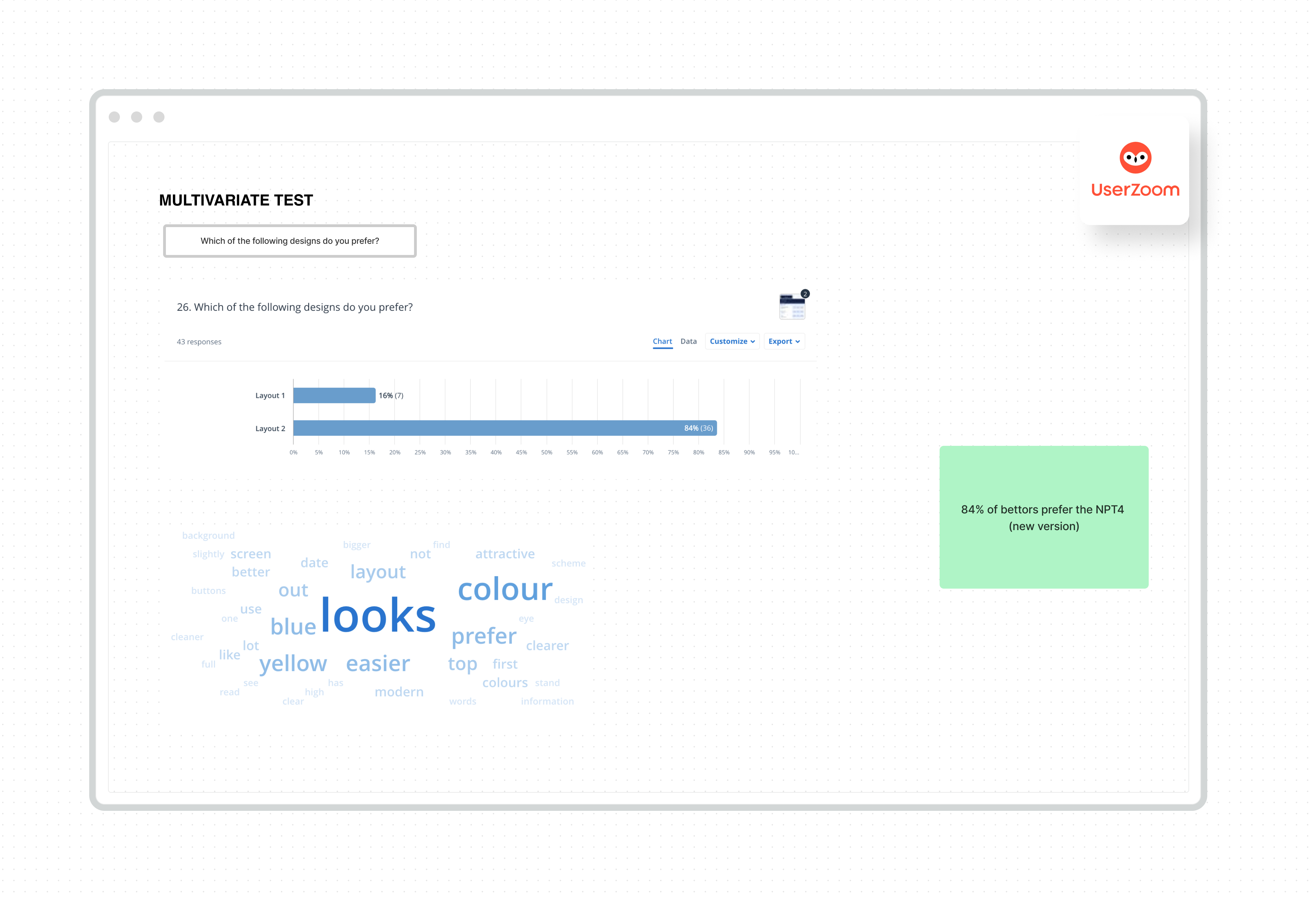
- 84% of bettors prefer the in the new designs to Live version
- Better ratings of perceptions in the new designs on a scale of 1- 5
- SUS improved a mean of 10%
- 25% more sports recognition in the new designs.
- 12% more positive and 14.6% less negative choice of words in the new designs.
- 74% of bettors prefer the new design to Live version.
- Better ratings of perceptions in the new designs on a scale of 1- 5
We presented the research findings, embedded in high-fidelity designs, to both stakeholders and senior figures within the organization.
Design
Next Steps
Developing a structured methodology for the Design team to test new styles, components, or journeys proved to be a game-changer in how we validated future designs. The extensive research enabled us to assess visual modifications in navigation, evaluate colour choices for In-Play events, and test icon recognition, among other elements.
This tool was invaluable in preventing the implementation of designs without proper validation, significantly reducing the risk associated with introducing a new design system without insights from our customers.
Documentation
All the documentation for this project is available in the following links:
UI testing documentation
Results presentation
Portfolio
PayasUgym Checkout UI/UXUI/UX Design
Oddschecker - Sport ConsolidationUI/UX Design
William Hill - Scratch of the DayUX Design
William Hill - Brand PerceptionUX Design