
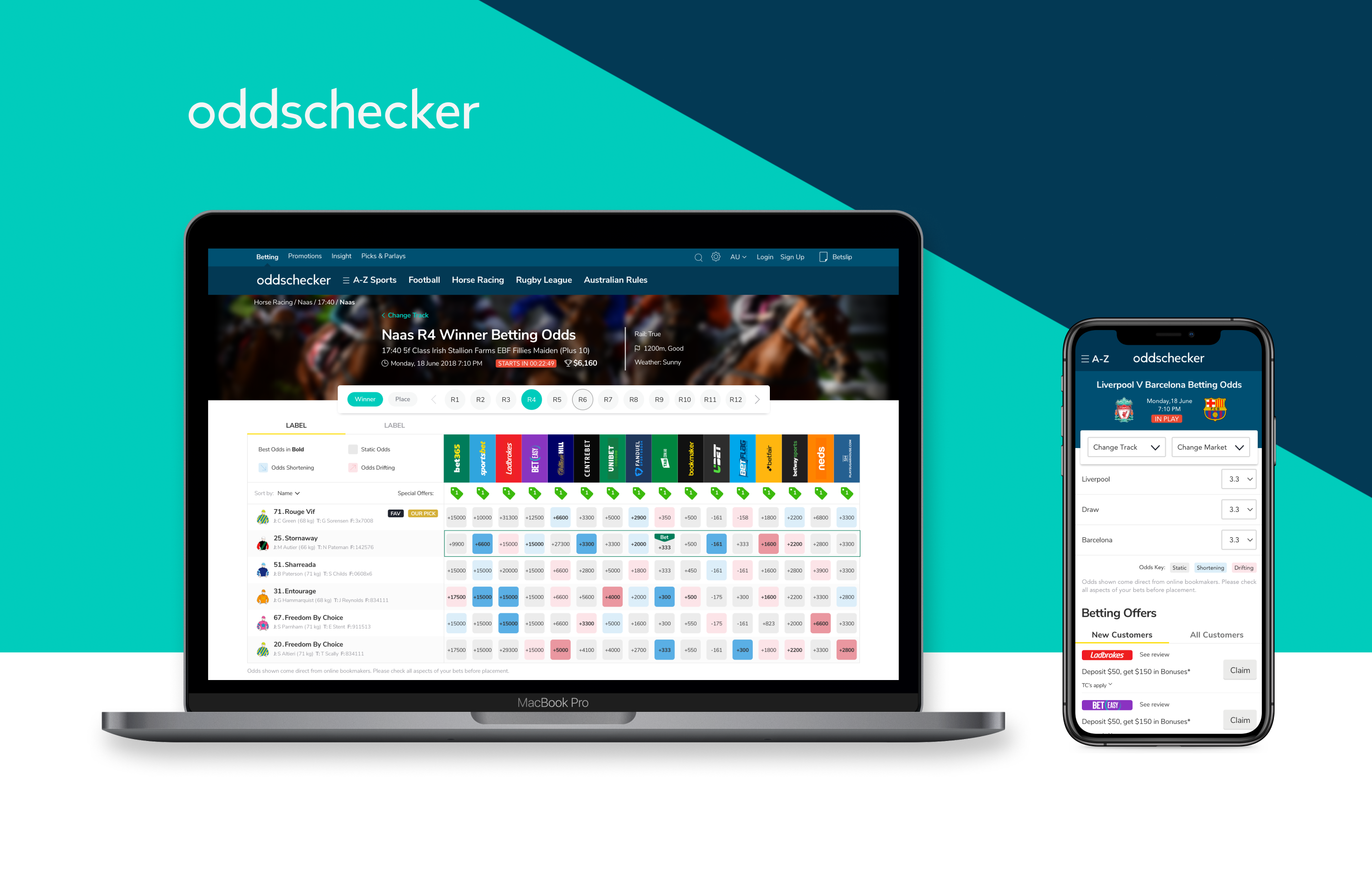
Oddschecker
Oddschecker is the leading odds comparison platform in the UK and it has a strong presence in the US, Australia, and Europe.
In a case study that I worked on, I held the role of the Lead Interface Specialist for Oddschecker Global Media's international websites. Our objective was to enhance the consistency of the brand, interface, navigation, and user journey throughout the platform.
Pain Points
In order to enhance brand awareness, it was crucial to maintain consistency across all international products. This could be achieved through the adoption of updated design principles, simplification of website navigation, improvement of customer acquisition strategies, and optimization of user interactions with website content.
By prioritizing these areas, businesses can create a more streamlined and cohesive customer experience, ultimately leading to increased engagement and improved brand recognition.

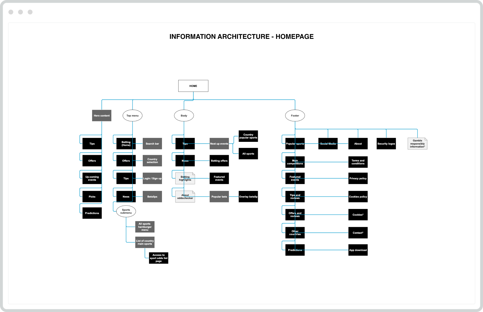
Information Arquitecture
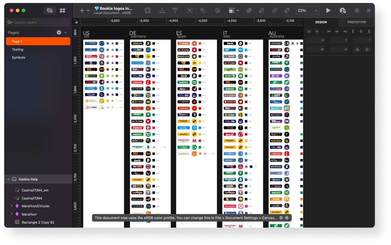
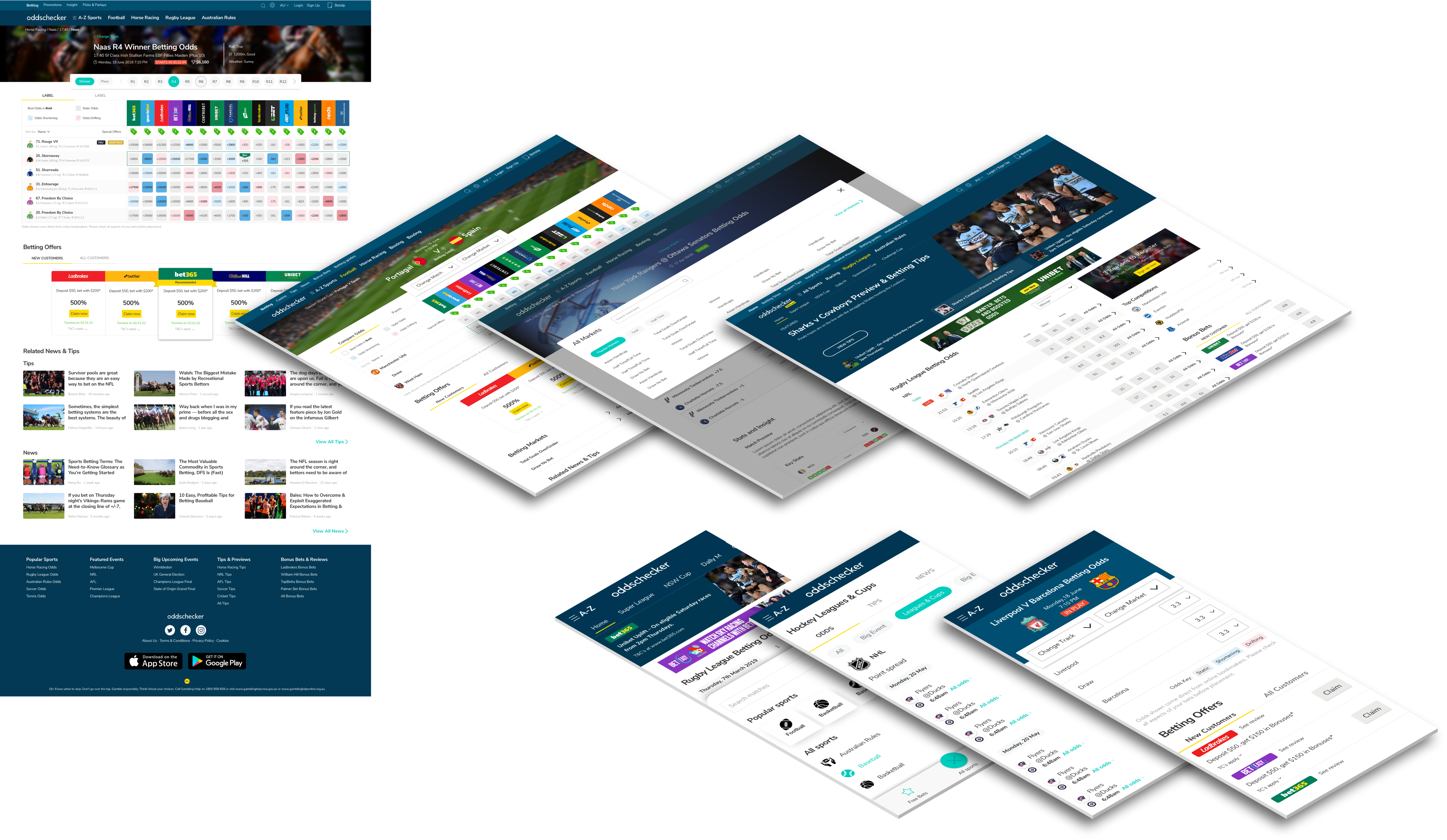
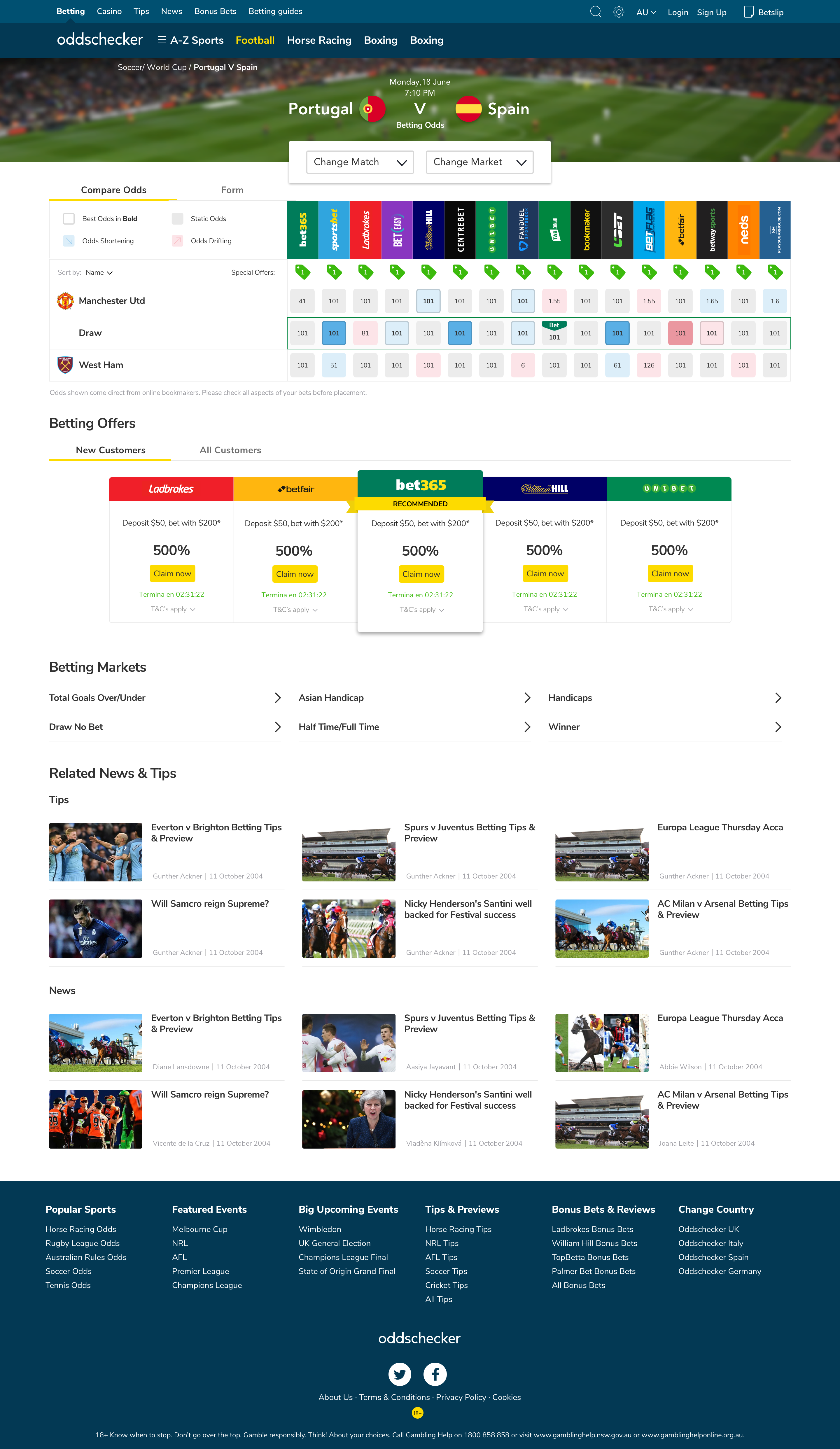
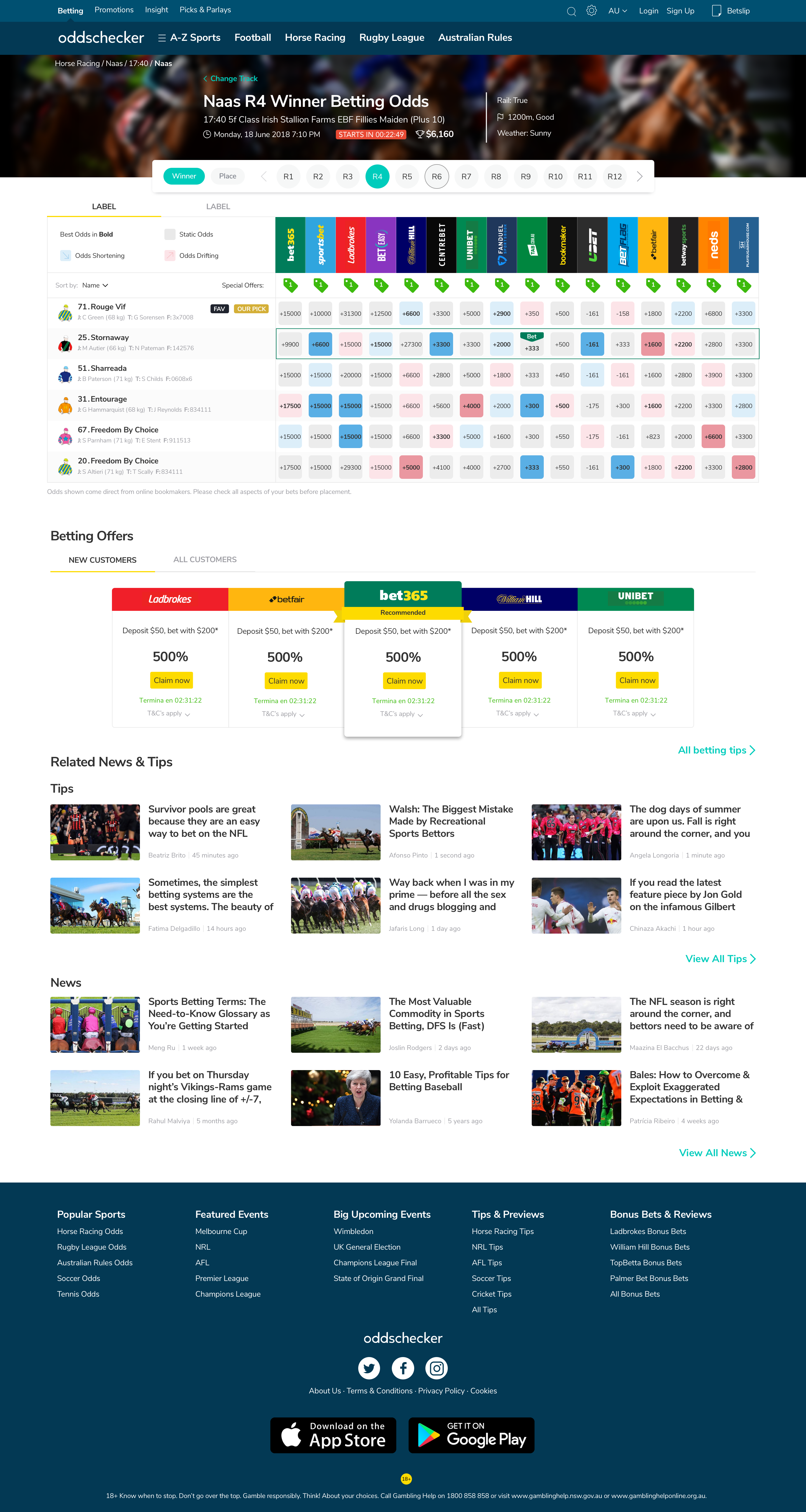
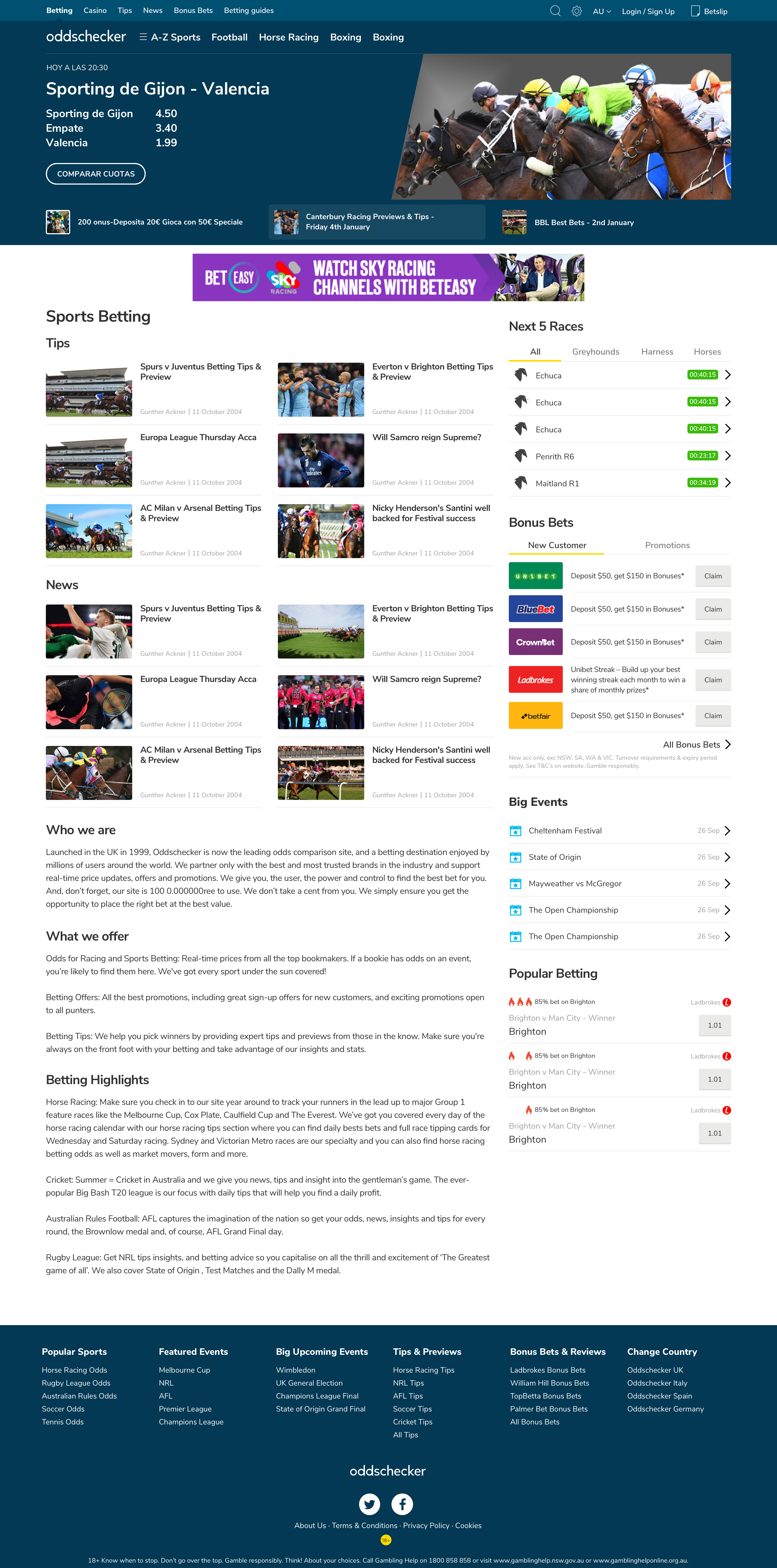
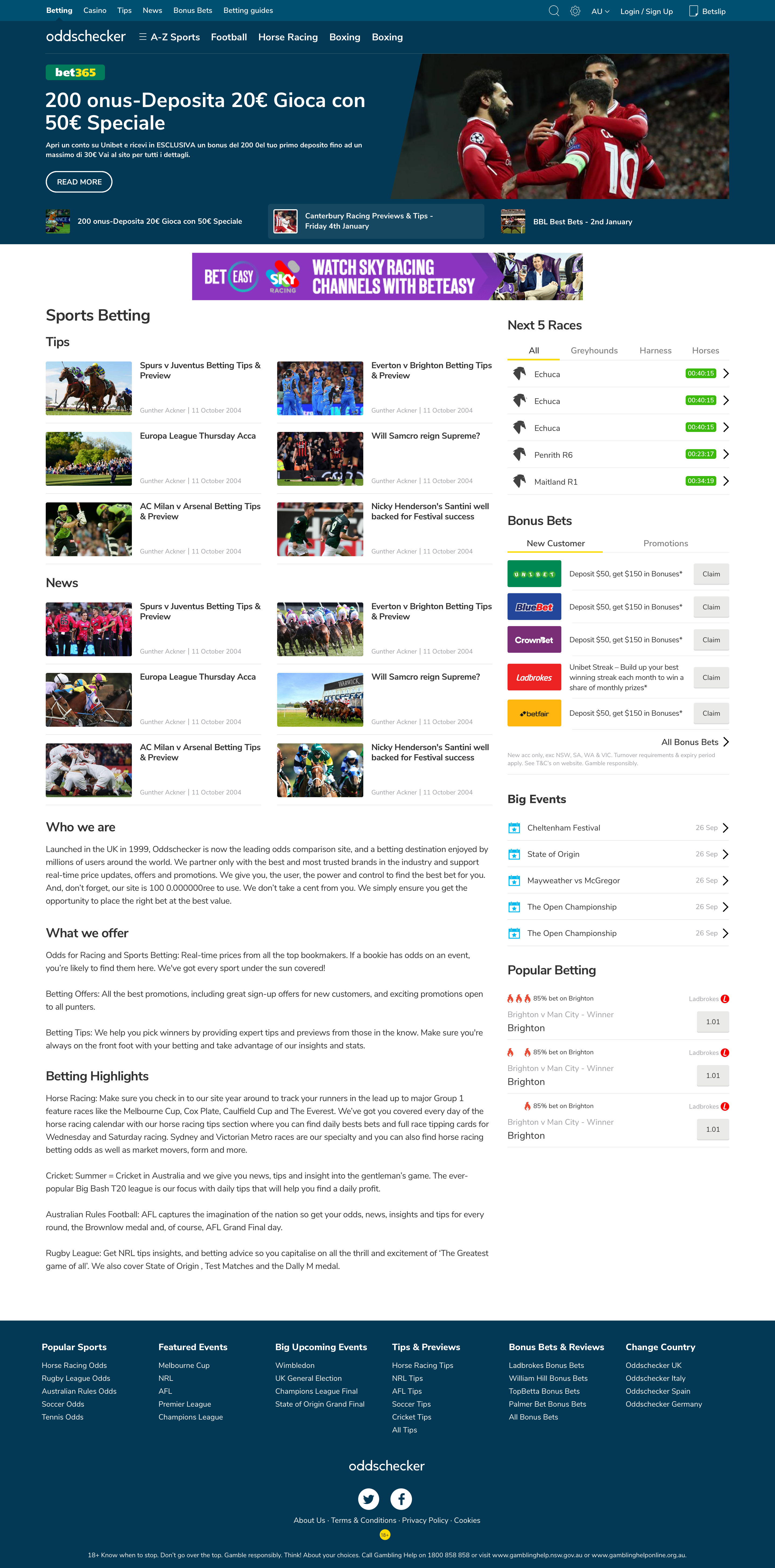
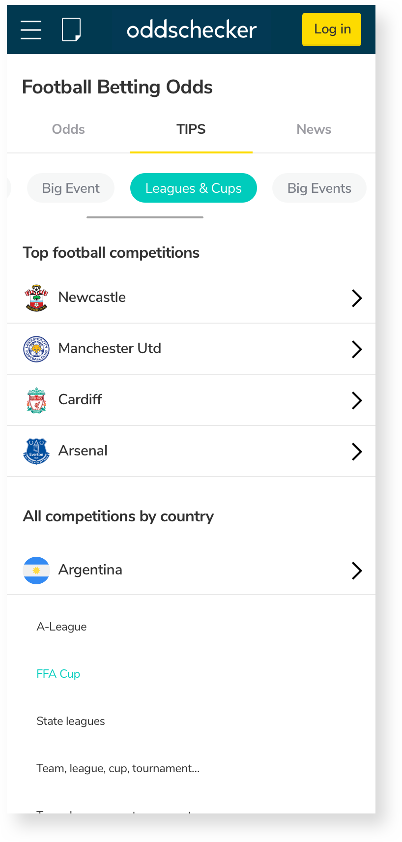
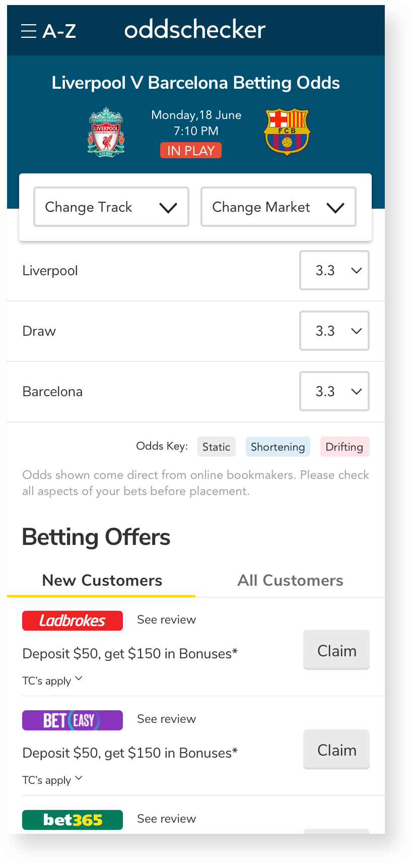
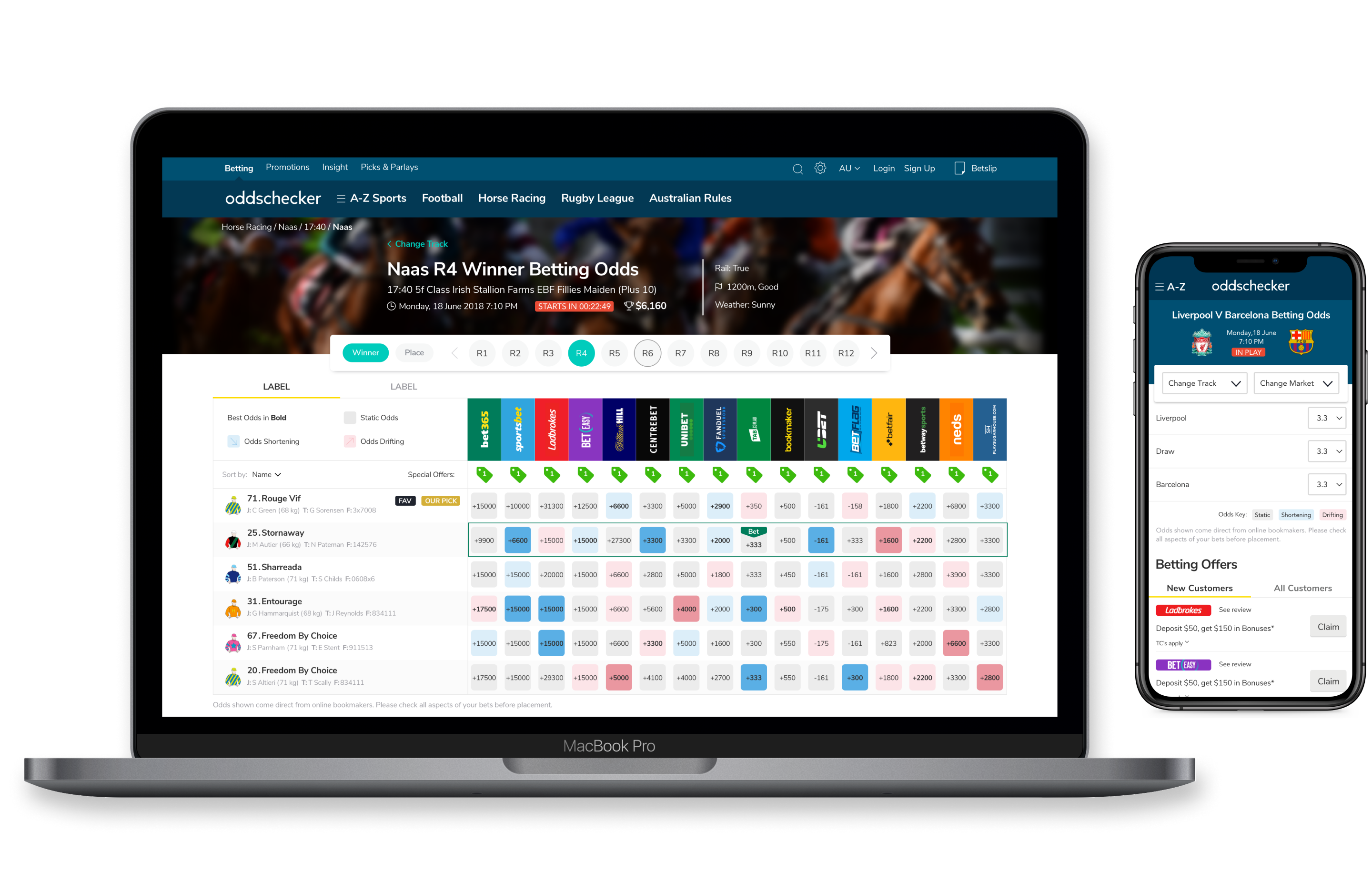
For this project, the first step was to create a site map that would identify all the different pages on the websites of Australia, US, Spain, Italy and Germany. All five websites shared the same main structure and only differed in terms of content, popular sports or odds formats.
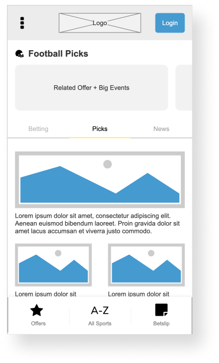
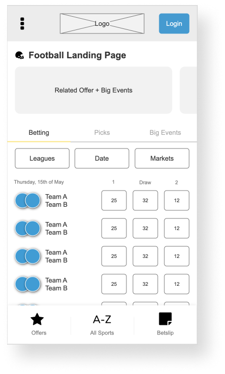
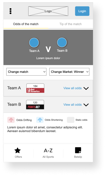
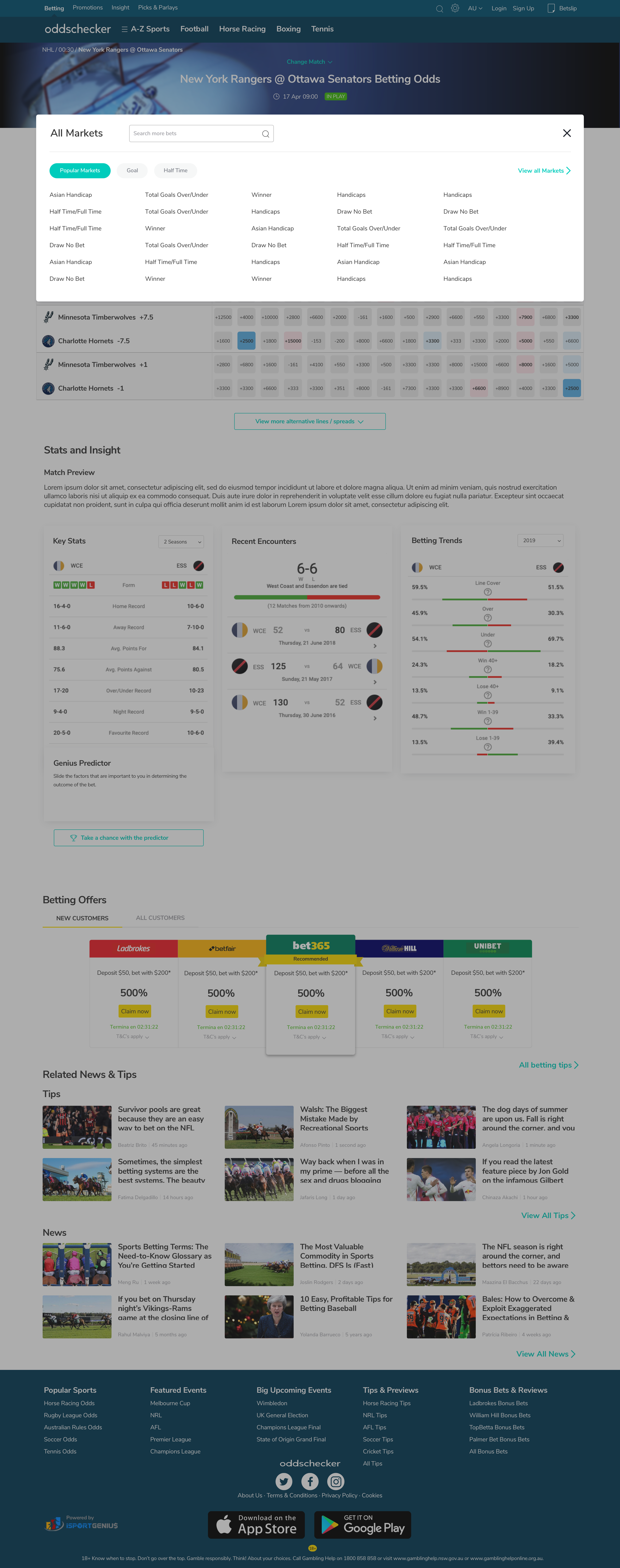
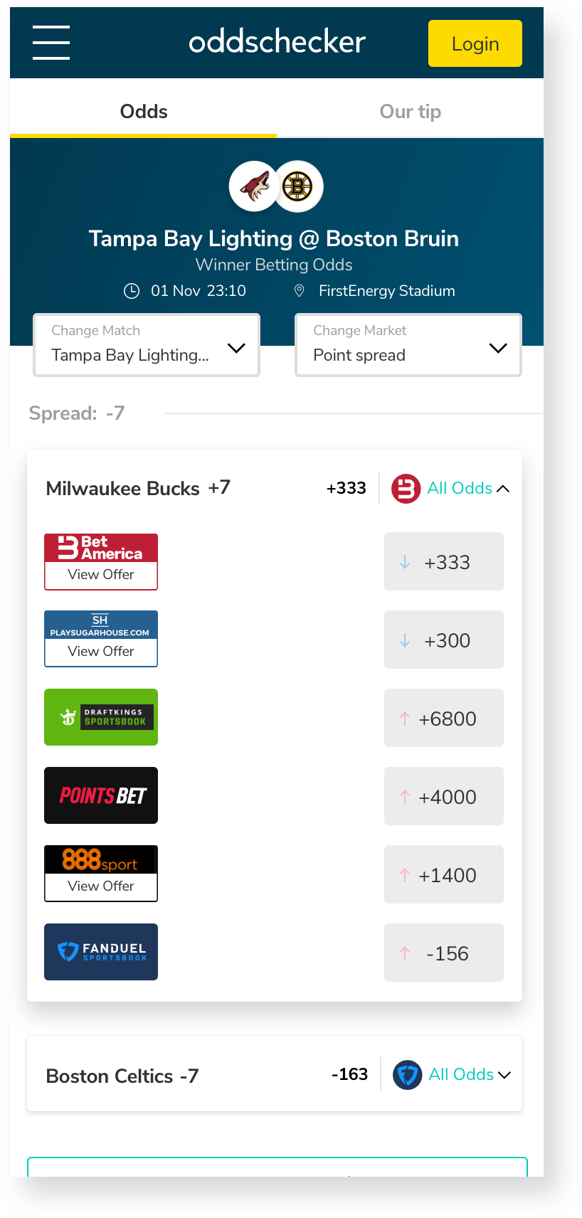
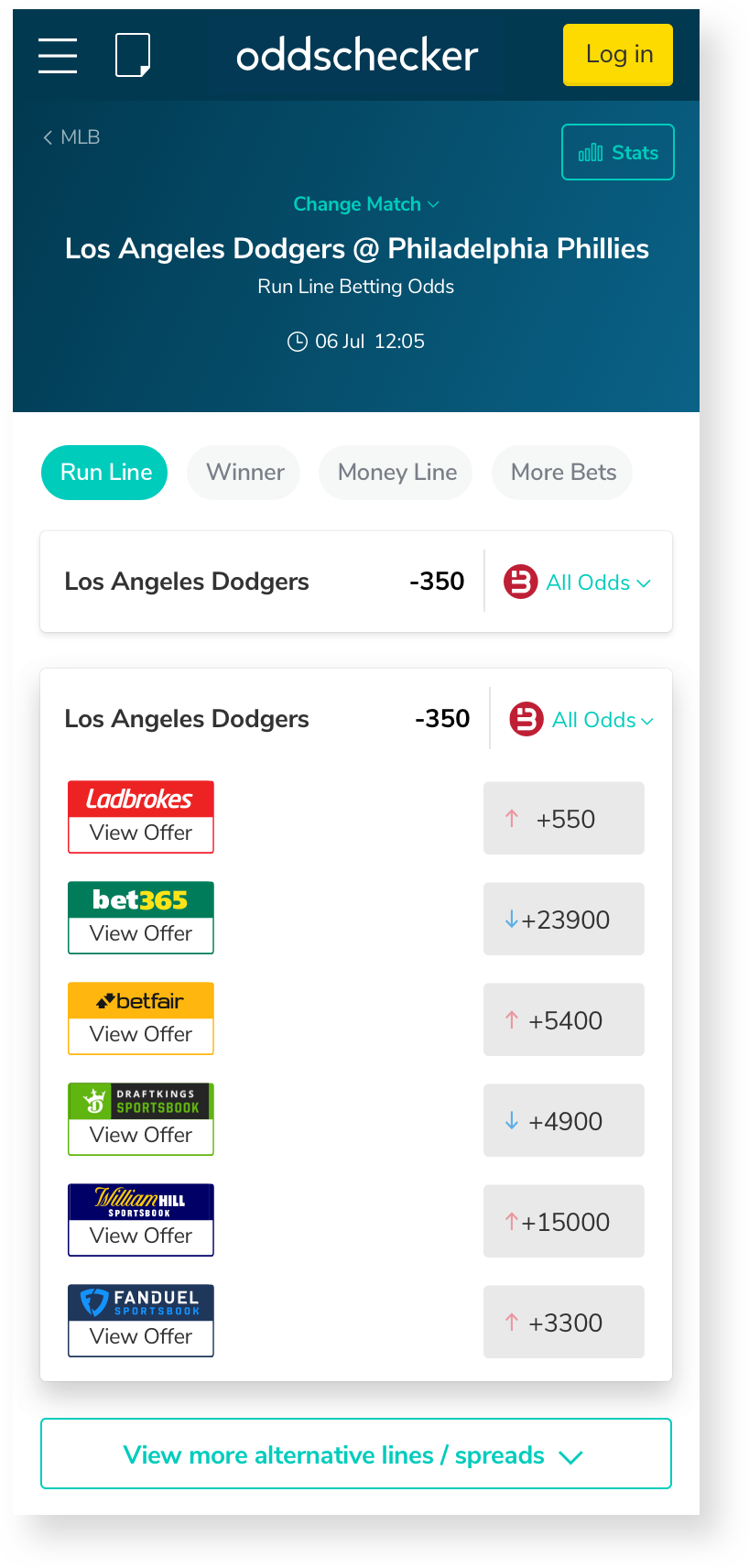
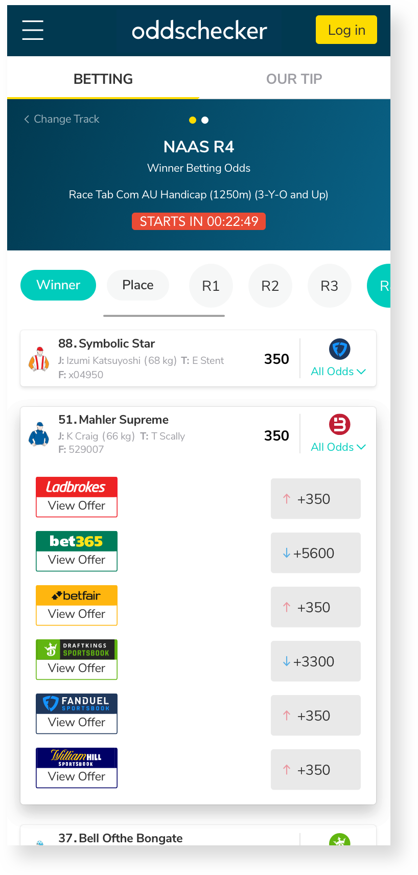
As part of the project, I was tasked with creating a template for the Sport Odds List Page and the Detail/Grid page.
Since each sport has its own specific requirements, the pages for each sport needed to display different information to help users make informed decisions before placing a bet. Therefore, it was crucial to outline the necessary templates. I identified three types of templates that needed to be implemented: Horse Racing, Football, and a general template for all other sports.
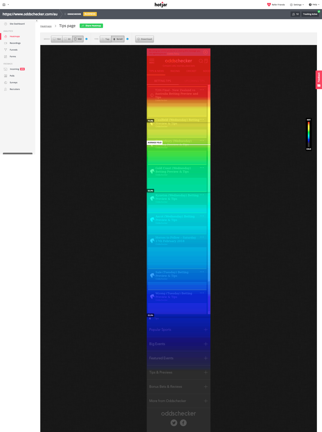
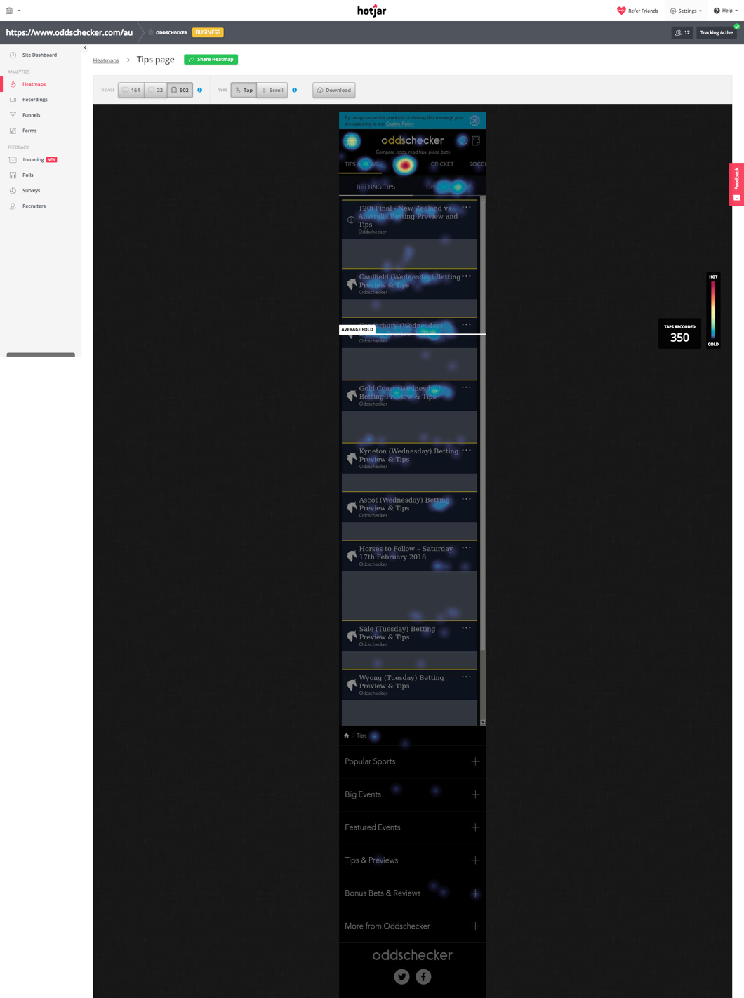
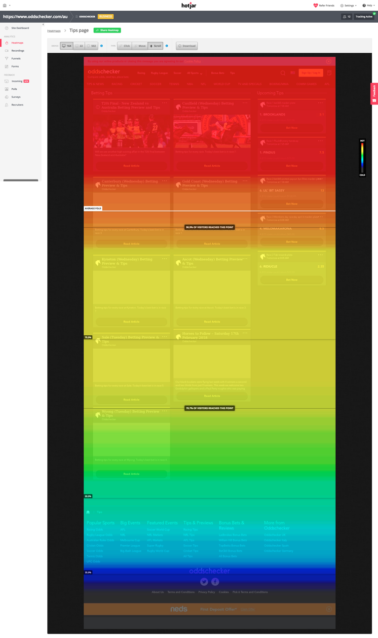
Tree Testing & Card Sorting
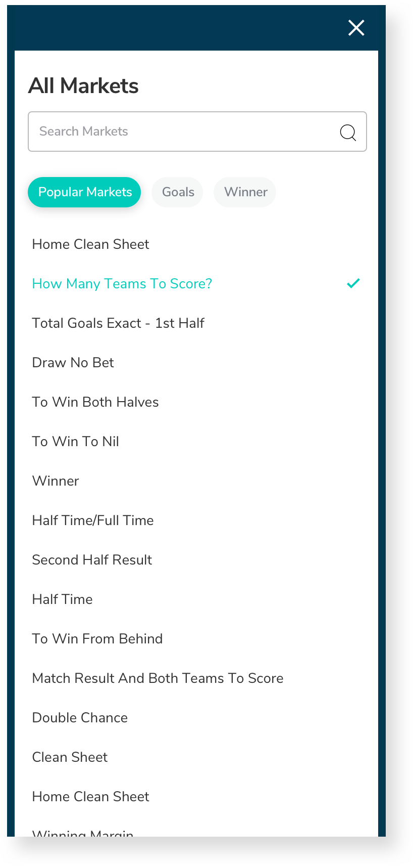
After conducting a usability test, it became clear that the website navigation needed to be revised to provide a clearer categorisation of the menus. The sports on the menu were not logically or intuitively ordered, making it difficult to find the most popular sports.
Additionally, sporting events were mixed in the same category as sports, making it impossible to view them. The main navigation of the site also presented problems and difficulties for users in finding content.
To address these issues, I conducted a tree testing to understand if the way the information was organised made sense to the user. This was then followed by a card sorting test to help organise the information in a more logical and intuitive way.
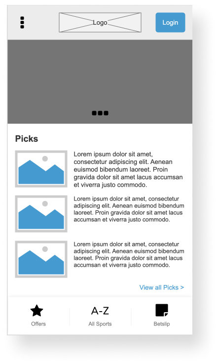
Low-fi wireframes
We successfully created intuitive and beautiful interfaces for this project after multiple rounds of wireframing iterations.
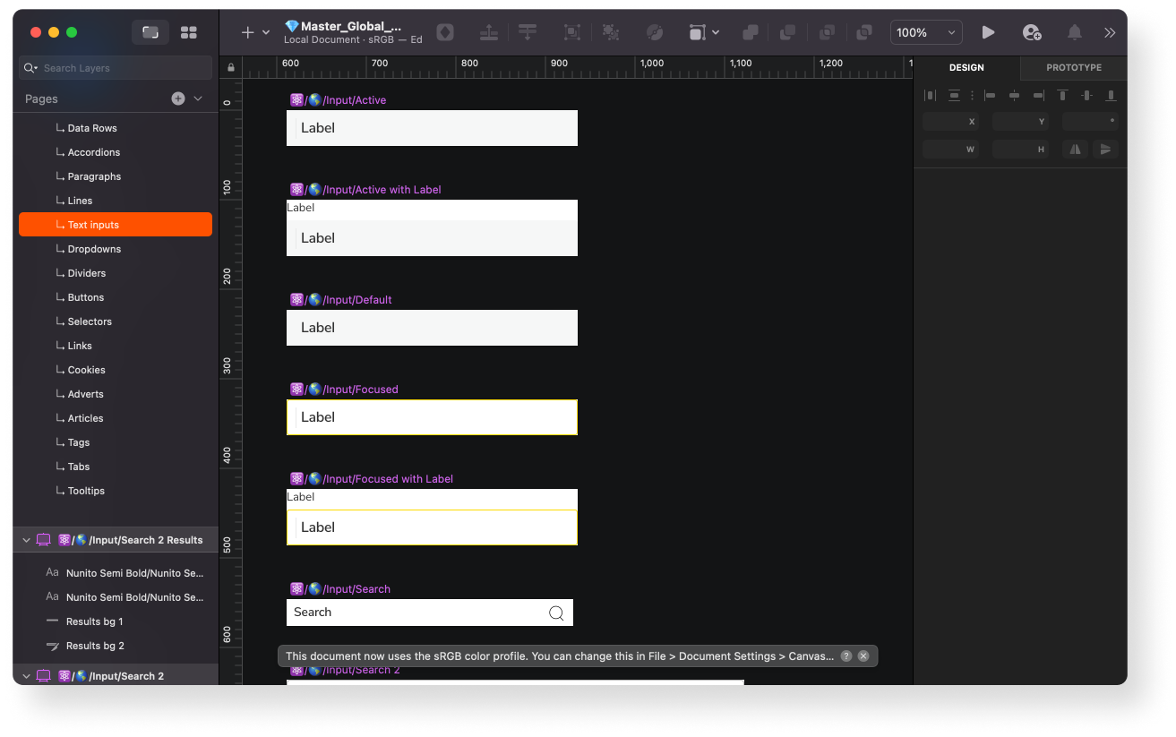
Design System
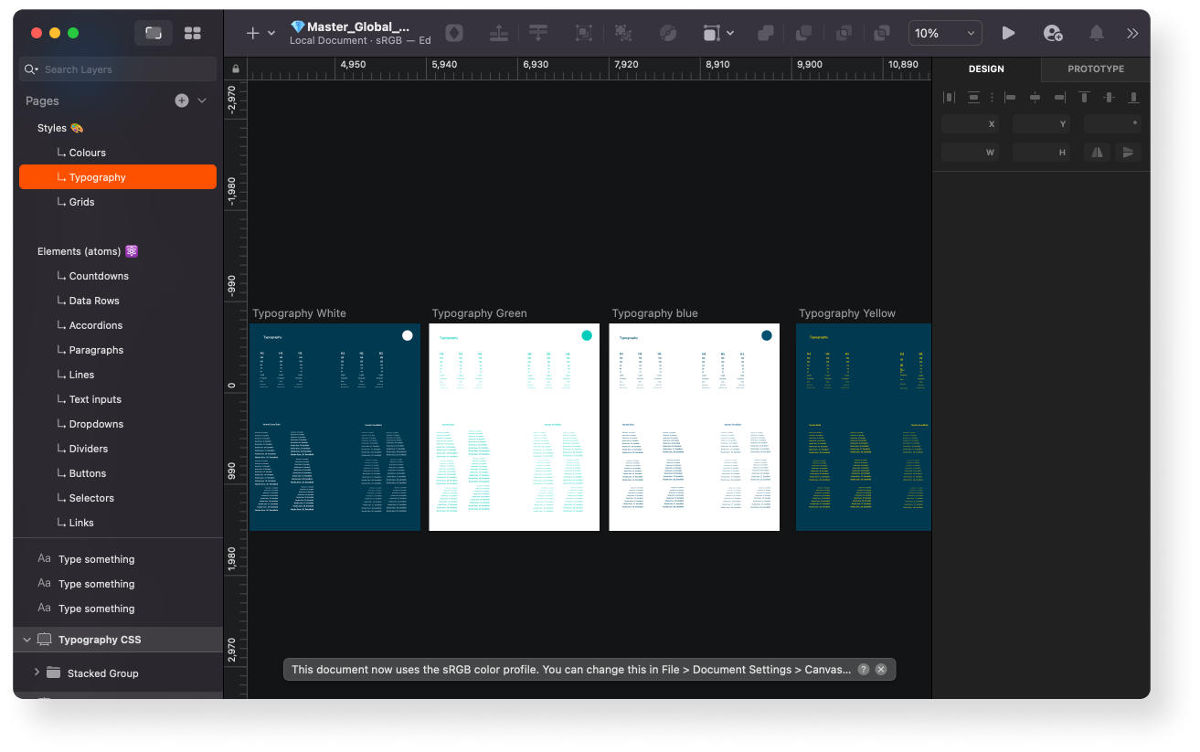
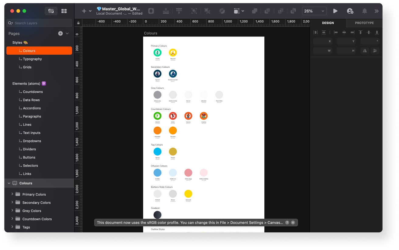
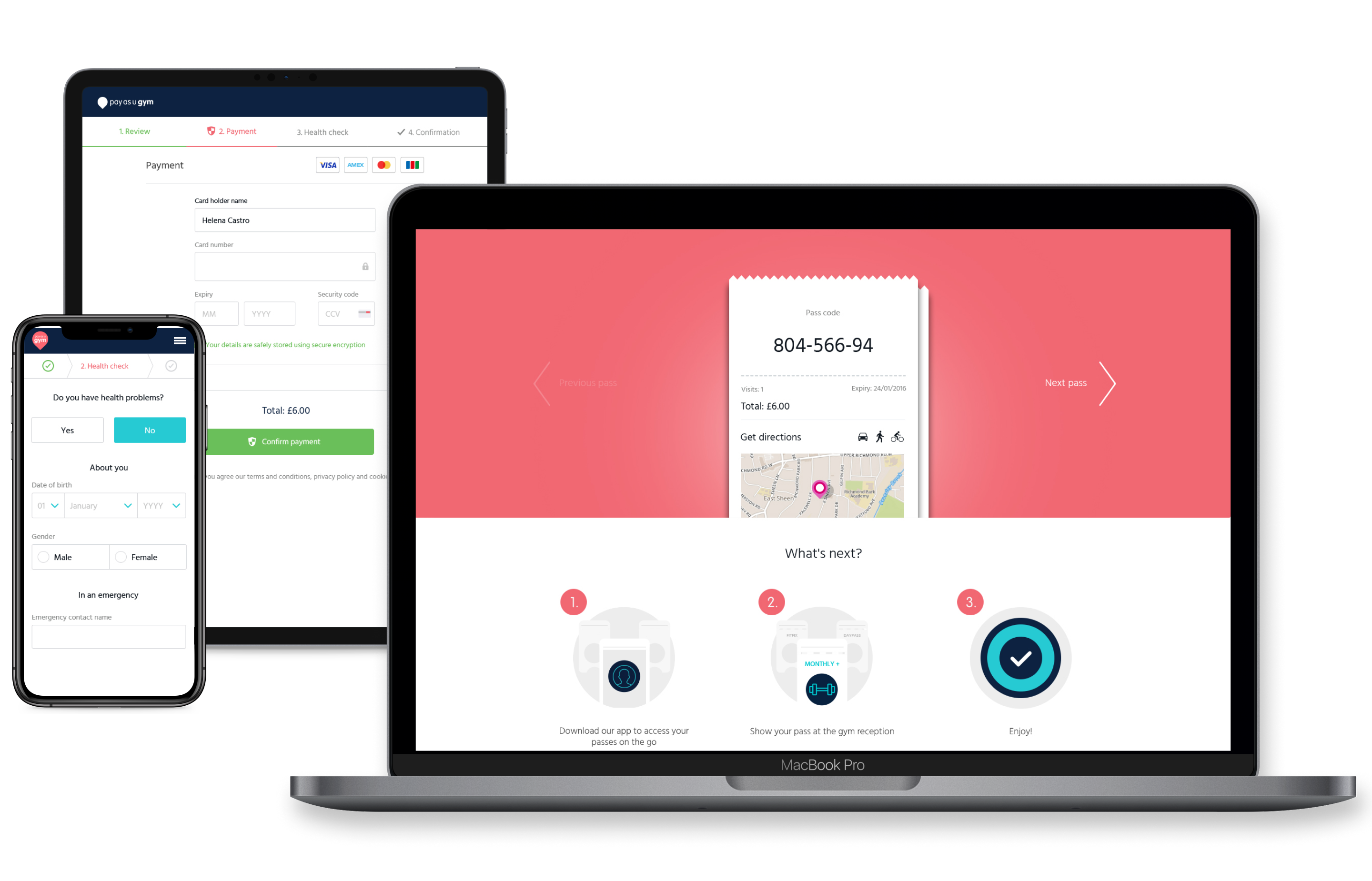
After having a well-defined Information Architecture and a clear roadmap of where we wanted to head next, we began designing our websites. The UK design team introduced a new logo, font, and color palettes that I was requested to follow. Apart from that, I had the freedom to come up with the best solutions for international customers. I started with the basic design elements and developed an atomic design system with a collection of reusable components. I guided this system with clear standards on how to use these components to build new applications.
User Interface Design


Testing
In general, people reacted positively to the new design and structure. They appreciated the simple interface and found it easy to move between all the pages. The time it took to complete a purchase was significantly reduced for all users.
However, we did come across some issues. For instance, some users had a hard time figuring out if vouchers had been applied to their accounts or how to remove promotions from their accounts. To address these issues, I made changes to the wireframes and prototypes and re-tested them.
Portfolio
PayasUgym Checkout UI/UXUI/UX Design
Oddschecker - Sport ConsolidationUI/UX Design
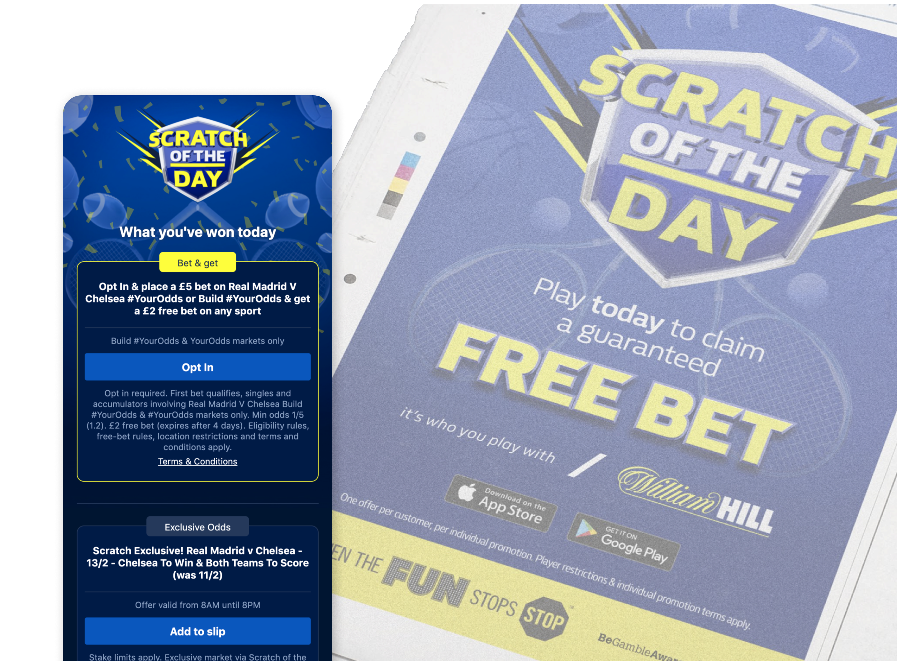
William Hill - Scratch of the DayUX Design
William Hill - Brand PerceptionUX Design